-
£18.99
Free fast U/K mainland delivery,
Free return
Secure checkout,
30+ years experience”
UK-based business.,
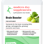
Stay sharp, focused, and energised with a balanced formula supporting mental performance, energy levels, and immune health — ideal for busy days, study, or work.
SCROLL DOWN (For more info.)
-
£17.32
Free U/K mainland delivery,
Secure checkout,
30+ years experience”
UK-based business.,
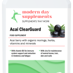
Organic acai berry with supportive botanicals for daily antioxidant protection, energy, and overall wellbeing.
SCROLL DOWN (For more info.)
-
£13.95
Free U/K mainland delivery,
Secure checkout,
30+ years experience”
UK-based business.,
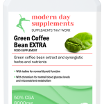
A gentle, natural extract from unroasted green coffee beans, providing a clean daily support option for those looking to maintain healthy lifestyle habits.
SCROLL DOWN (For more info.)
-
£21.48
Free U/K mainland delivery,
Secure checkout,
30+ years experience”
UK-based business.,
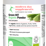
A clean, organic blend of greens, berries, vegetables and herbs — crafted to support daily vitality, digestion, and natural balance. Simple, plant‑based nourishment for everyday wellbeing. –
SCROLL DOWN (For more info.)
-
Sale!
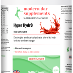
£18.99 Original price was: £18.99.£15.99Current price is: £15.99.
Free U/K mainland delivery,
Secure checkout,
30+ years experience”
UK-based business.
On Special Offer
HyperHydr8 is a clean, sugar‑free electrolyte blend designed to deliver fast hydration, natural energy and muscle support. Ideal for training, busy days and everyday wellbeing.
SCROLL DOWN (For more info.)
-
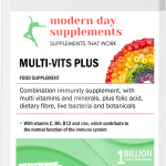
£11.49
Free U/K mainland delivery,
Secure checkout,
30+ years experience”
UK-based business.,
A gentle, everyday multivitamin with essential vitamins, minerals and botanicals — simple, steady daily support in one capsule.
SCROLL DOWN (For more info.)
-
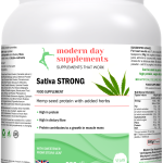
£19.88
Free U/K mainland delivery,
Secure checkout,
30+ years experience”
UK-based business.,
A clean, plant‑based hemp protein powder designed to support strength, recovery, and daily vitality. No sweeteners or additives.
SCROLL DOWN (For more info.)
-
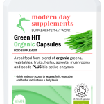
£17.74
Free U/K mainland delivery,
Secure checkout,
30+ years experience”
A clean, organic greens blend designed to support natural energy, focus, digestion, and everyday vitality — all in one easy capsule.
SCROLL DOWN (For more info.)